Matt Keegan: I learned about the bridge color palette that is maintained by New York City’s Public Design Commission, from an arts writer named Graham T. Beck. We were seated together at our friends’ wedding. Graham wrote about this commission for the New York Times in the fall of 2008, and when we met he was in the process of writing a larger article about the federal color palette, which is this color deck (shows).
ZK: This is a real thing?
MK: That’s the real color deck! You can order it for $158.
ZK: It seems like an artist book except it’s useful.
MK: I know, it seems like a Ruscha multiple. So the NYC commission maintains seven colors for bridges in the five boroughs, which include: Deep Cool Red, Federal Blue, George Washington Bridge Gray, Aluminum Green, Pulaski Red, Munsell Gray and Dark Green. Federal Blue and Deep Cool Red are my personal favorites. And, this Federal deck is used for anything that’s maintained by federal money — from mailbox blue to colors used by OSHA and NASA, the highway system, parks, etc. I became really interested in the idea that, of course, color is also a language! When you think about it in these familiar applications, like language, things disappear or are taken for granted. For example, you may not think about the blue of a mailbox nor would you think about the color of the George Washington Bridge as you traverse it, but they are particular, maintained and applied colors.
ZK: Are you using especially anonymous colors? Or they become iconic only when they’re applied to something? With the Golden Gate Bridge, there’s all of this labor, painting and repainting, and it’s the icon of a city. But when you isolate the color from the object, when it’s just applied to panels, it becomes symbolic.
MK: I think the Golden Gate Bridge is an anomaly for how the red resides in such an open expanse. You see the grandeur of the Verrazano Bridge when you go to the Rockaways but in New York there’s a different density of information, so you don’t see bridges in the same way you do in San Francisco. Byron Kim is the artist representative for the Public Design Commission, and four colors were added to the commission during his tenure. He mentioned two interesting details that were considered in selecting colors for bridges: one was thinking about the colors in relationship to the sky, which I think is beautiful to consider, and the other criteria which was used to determine the red for the Hell Gate Bridge is that this color was chosen specifically for how it would fade. It’s interesting to think about color as something durational. Graham T. Beck wrote that the federal color palette was initially created to simplify the manufacture of camouflage green. There were too many different greens in use so there needed to be a way to systematize one uniform color.
ZK: These are large-scale industrial applications. I read something a while ago that referred to your practice as ‘domestic conceptualism.’ But maybe we could think about some of the work in terms of urban conceptualism. There’s a recurring interest in cities. In particular, your last show felt like a love song to the city you live in. I sometimes forget that you’re also a photographer, so those color panels served as a background for these photographic observations. I thought that was a nice fusion, these observations of the city against the colors of the city.
MK: Yeah, the photographs provided a walking pace of the city. I wanted them to have a meandering quality, because the palette was rooted in this particular color system and other parts of the show were also quite specific. For example, I made a book called A History of New York that was an image-based iteration of the Ric Burns PBS series New York. My documentary short, Biography / Biographer, is about my father’s experience working at a private golf club frequented and later condemned by Robert Moses. I thought that these components had different registers of fixity and I wanted the photographs to have a more open logic. They were not depicting a particular neighborhood nor telling a specific story.
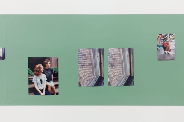
Keegan’s ‘Untitled (Group 11),’ 2011. courtesy of the artist.
ZK: You just had a camera and walked around?
MK: Yeah I would say for over the course of about a year, I took a lot of pictures and the sixty that I exhibited were probably the edit of, I don’t know, three hundred or so —
ZK: A million?
MK: laughs, there were a million, or so photos. It’s interesting because although photography has been a really consistent part of my work, for years now, I’m always negotiating my relationship to it. It’s pretty irrelevant at this point, but I never studied photography in school.
ZK: It’s nice when you don’t know how to do something, it kind of keeps it interesting.
MK: I think about photography all the time and it directly impacts my thoughts about making videos.
ZK: The Biography / Biographer video in which your dad talks about Robert Moses was interesting. Just to hear about the person that instituted all these changes. We’re in Greenpoint now, and they just announced that they’re going ahead, and at the end of this street they’re building ten different forty-story towers that will completely transform this neighborhood. I feel like sometimes there’s so much change and it happens so fast, and it didn’t used to be like this. But watching this video, one realizes change is not new, it’s constant.
MK: Watching the Ric Burns’ documentary New York, was such a good continuing ed class for learning about the city. What’s clear early into the series is that from Alexander Hamilton to DeWitt Clinton and on, New York City has always been rooted in commerce, and is always in the midst of change. Robert Moses generated a tremendous amount of public projects as the “Master Builder” who was specifically focused on the automobile, and outward expansion to Brooklyn, Queens, Staten Island and Long Island. The building of condos on the waterfront of Greenpoint is just another form of an ever-changing NY landscape.
ZK: I guess now everything is being connected by ferry, which is interesting because it’s becoming a waterfront city like Chicago. Weren’t you just in Chicago for a show and made a book…?
MK: Last fall, I was in a three-person show at the ART Institute of Chicago and I made an iteration of my A History of New York book. I tabbed in bookmarks that feature information extracted from a PBS series called Chicago: City of The Century. I watched this series and took highlighted facts that I found noteworthy and then tabbed them in within the chronology of pre-1900’s New York.
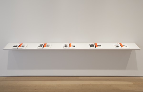
‘A History of New York (for Chicago),’ 2011. courtesy of the artist.
ZK: I should look at this thoroughly at some point. We’re jumping around a lot, but that’s because you do a lot of different things. And they’re not unrelated. There’s an interesting relationship between the books you’re making and your text-based sculptures and wall-paintings. The sculptures have this simplicity and repetition, it almost seems like if you actually read it, it would feel like reading Gertrude Stein. But a book and a sculpture aren’t read the same way. Even if there’s a top and a bottom sometimes it’s hard to discern a left and a right.
MK: I began recent talks at the Art Institute of Chicago and at NYU by showing Biography/Biographer followed by a short 2-channel video called N as in Nancy, that features my mother alongside a series of images that she hand-assembled to teach English-as-a-Second-Language classes. As an image appears on the right-hand side, my mother immediately assigns words and phrases to them. I have some of them here.
ZK: Are these the actual flash cards? (laughs) Your mom is a good artist.
MK: She is! I go through about sixty of her flash cards over the course of the 3-minute video. So, for these lectures, I play the video of my father, I show install shots of I Apple NY, and then I show install shots from Lengua, which is the recent solo show I had at Altman Siegel that features the video of my mother. And I spoke about how I’m interested in trying to figure out the space of overlap between these two videos and exhibitions. And, I come to, not a conclusion, because who wants to make anything conclusive, but the video of my father is abiding by a set of familiar parameters that we’ve become accustomed to on PBS, and I made a documentary that abides by a similar structure — it has a musical score, there’s archival footage, there’s a talking-head shot that guides most of the narration, etc. If you saw it on PBS, it wouldn’t feel out of place. The video of my mother is completely different. It’s an art video without question. She’s assigning a set of words and phrases to a set of images that are implicitly intended to be read. Anyway, I bring up those lectures because my interest in language is the most foundational thing to my art making. I have always been interested in working with familiar phrases. With the I Apple NY show and Lengua the color system was really different. For Lengua, I chose colors that were related to the phrases, so for Nothing to Declare it’s green because green means go. It’s similar to the green used in EXIT signs. There are certain decisions that I made that were really dumb and they weren’t rooted in a particular color system. I’m trying to figure out the space between those things. What’s the space between the PBS-like documentary and the short video of my mom working with these images and language? There’s something perverse in both, and both are contingent on subjectivity but I don’t know, it’s hard to articulate. I’m certain that language is at the root of all of the work and our ability to communicate — that’s a central feature as well.
ZK: It seems like the way you’re using your mother’s ESL flash cards at the Kitchen right now is a distillation of all these disparate parts of your practice. There is this editing and cutting of the images, or cropping, and then this fundamental relationship of images to words. Looking at the work from the Kitchen, it’s striking that a lot these things are found images. In the past, a lot of your photographs (like Sundays) were photos of found objects.
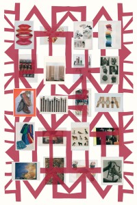
‘Grids,’ 2012. courtesy of the artist.
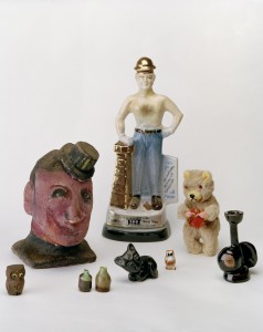
Keegan’s ‘Sundays,’ 2009. courtesy of the artist.
MK: Yes. I had a show in San Francisco that featured a photograph titled Sundays that included items that I purchased at a weekend flea market while I lived in the Bay Area. This show, called Postcards and Calendars, was a precursor to I Apple NY. Rather than making photographs to generate a portrait of a city, I tried to create photographs that were stand-ins for days and months. This started from wanting to make an image of January 2009, before Obama officially became president. I hired someone to make a tracing of the New York Times image of Obama arriving in Virginia and then I photographed that tracing. I also exhibited twelve calendars, loaned from the Gay, Lesbian Bisexual Transgender Historical Society from San Francisco that included calendars that recorded political marches, local businesses, local queer collectives, softcore porn, and handmade calendars. All of that material provided me with ways to consider how a historic moment and time in general could be recorded. Local and personal histories are a part of a larger recorded history. This is another topic that tends to permeate my work.
ZK: In these photos, you’re recording a day with an image, and the calendars are tracing time with images. It’s interesting in this video with Eileen Quinlan at The Kitchen, you frame your dialogue (presented as a transcript), placing it in the context of current events.
MK: I see the video, Teleplay, as negotiating time in three parts. The first part is biography, the past that we experienced. Then the second part is thinking about how time is mapped, from the generic — the first time you get drunk, when you lose your virginity to when you get your first job. Then the third part is the contemporary, what’s happening at the time of making the video both in our lives and in current events.
ZK: I know you will also have prenatal and restorative yoga classes as part of the exhibition on December 11th. Can I come to the restorative one?
MK: Of course!
ZK: Do you have to bring your own yoga mat?
MK: No, I made custom yoga mats.
ZK: Design seems to feature prominently in all these shows.
MK: I joke with my color printer, that when I opened the I Apple NY at D’Amilio Terras that it was my coming out as a photographer show, slash my coming out as a graphic designer. Working with David Reinfurt to make the show’s logo, interviewing Milton Glaser, both injected some serious design-related discussions. And, I continue to work with my mother’s flashcards and her request to read images textually — there’s design within that. One of the things that I find fascinating about my mother’s collection of images — that I have been thinking about now for almost two years is the fact that she overrides their larger cultural reading. For example, in N as in Nancy I show her a photo of Martina Navratilova and she says “Martina Navratilova,” but when I show her an image of Burt Reynolds she says “happy,” because he’s smiling.
ZK: Mmm, yeah.
MK: You could make a case, that, oh but, Burt Reynolds’ identity overshadows the fact that he’s smiling. I like this very productive misuse, as she’s teaching people a new language.
ZK: I feel like the function of design is to tell you something, or tell you something fast, and with advertising to sell you something, or sell you something fast, but in your appropriation of the ‘I HEART NY’ logo I felt like there was a lot of misreading. I read what I thought it was going to be first, then had to backtrack. I don’t know if it’s the same with these images, it might be culturally specific, but either way people see based on what they’ve seen before.
MK: Yeah, and she sometimes used these flashcards to teach high school students but mainly implemented them to teach Central and South American adults during the evening. There’s a lot of information to the cards, but they are designed objects, they are laminated images, they are intended for handling, there’s aesthetic decisions made in terms of affixing certain images to fluorescent poster board or construction paper. There’s very specific decisions in the way they are cut to remove text that she did not find relevant to her lesson. There’s art direction going on.
ZK: Editing.
MK: Yes! I mean she’s really creating, she’s working with images that she thinks are good surrogates for the language lesson of that week and she’s cutting them and mounting them so that they have a property like signage, and it’s posited that there’s a legibility. Also, as someone who’s interested in the more amorphous space of history and how we can create archives, my mother’s 400 double-sided flashcards create a strange portrait of the middle class and aspiring America of the 1990s. There was high employment and a surplus of money rooted in a Clinton era where there was a thriving middle class– it’s an emphatically American collection.
ZK: The way these are edited reminds me of some of your earlier collages. Editing is not so different from cutting.
MK: I began working with photographs in making collages. I was interested in layering and combining different locations, people, and moments. For the photo-based work at The Kitchen, I’ve returned to collage techniques but these photo/painting hybrids are rooted in the plane of the wall and are on a much larger scale. That seems like a good place to end.
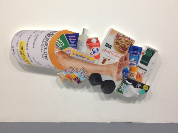
‘Cornucopia,’2012. courtesy of the artist.
Matt Keegan and Eileen Quinlan’s ‘Y? O! G… A.‘ is on view through December 22 at The Kitchen, 512 West 19th Street, New York.
]]>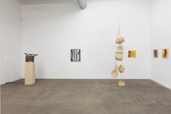
installation view of works by Mary Simpson, Josephine Pryde, Ull Hohn. courtesy of Bortolami.
now I am quietly waiting for
the catastrophe of my personality
to seem beautiful again,
and interesting, and modern.
Curated by Tom Burr
Bortolami
Bortolami’s artist-curated shows are consistently excellent,
and Tom Burr’s is every bit as good as Rich Aldrich’s ‘Addicted to Highs and Lows’.
Visual relationships between work, and invisible relationships between people
result in a doubly potent presentation
(all without the transformative authorship that’s so important in Burr’s own work).
Josephine Pryde’s slowly spinning wicker and hook sculptures alone are worth a visit.
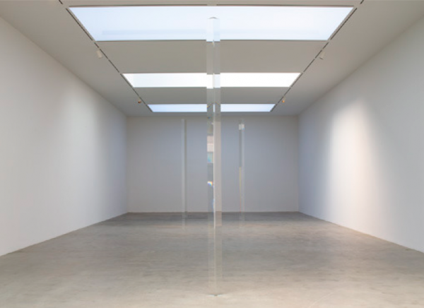
installation shot of Irwin’s ‘Dotting the i’s, Crossing the t’s,’ 2012. courtesy of Pace Gallery.
Dotting the i’s & Crossing the t’s
Robert Irwin
Pace
If it looks too good to be true, it probably is.
But if you can barely see it, thats the best.
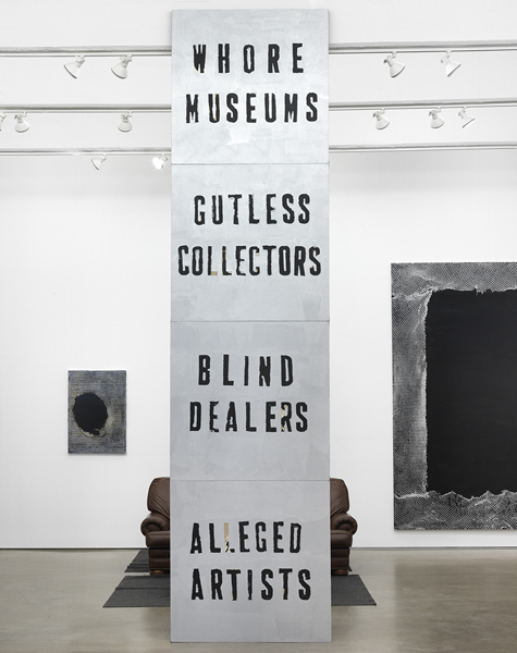
Flood’s ‘Endless Column,’ 2012. courtesy of Zach Feuer.
ARTSTAR
Mark Flood
Zach Feuer
A slight variation on a tried and true formula.
Hang the walls with benign, decorative canvases
(that look like the same painting everybody seems to be making),
and radicalize/conceptualize/frame with one tired attempt to offend.
The result is everybody win$.
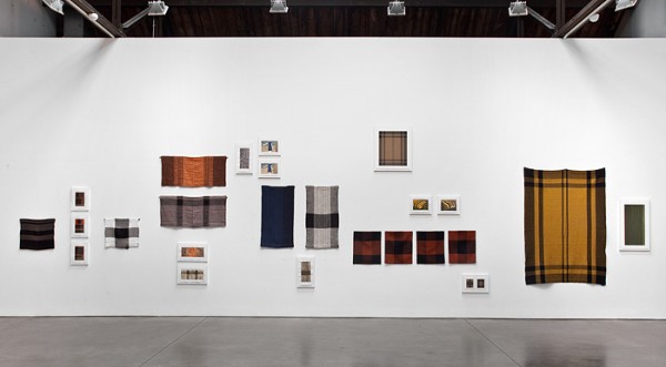
installation shot of Zitell’s ‘Fluid Panel State.’ courtesy of Andrea Rosen Gallery.
Fluid Panel State
Andea Zittel
Andrea Rosen
That Zittel is weaving new currency with old credit could not be further from the truth.
As it unfolds, it is generous and generative, its strength in a mind-boggling thoroughness in thought and process.
From Alighiero Boetti to Sol LeWitt, and now Zittel,
Fluid Panel States affirms the great potential of following instructions to their inconclusive end.
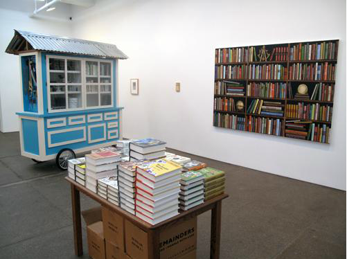
Installation view of works by front: Allen Ruppersberg & from left to right: Mark Dion, Steve Wolfe, Sean Landers. courtesy of Friedrich Petzel.
The Feverish Library
group show
Friedrich Petzel
Water water everywhere but not a drop to drink.
Or, a lot of books but nothing to read.
In addition to anything else,
The Feverish Library makes a compelling case that,
book-art, is a category, that includes a lot of people.
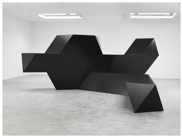
installation view of Smith’s ‘Source,’ 1967. courtesy of Matthew Marks.
Source
Tony Smith
Matthew Marks
It’s real steel sculpture.
And reminder of shifts in scale.
Now the best sculpture fits the consumer, the residential, the studio apartment, the efficiency,
but 100 years after this birth, Tony Smith’s enormous influence isn’t measured in weight, mass or volume.
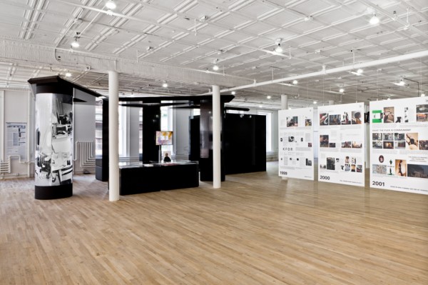
installations shot of Bernadette Corporation’s ‘2000 Wasted Years,’ 2012. courtesy of Artists Space.
2000 Wasted Years
Bernadette Corporation
Artists Space
BC is pretty good at making things that look pretty good,
and pretty smart at making things that look pretty smart.
In their exhibition, BC courageously Recycles and Reuses old images, objects, and ideas
until they’re Reduced to looking pretty bad and pretty stupid.
But waste, the removal not creation of value, might be the point,
and this show (billed as a retrospective) seems like the end of the line.
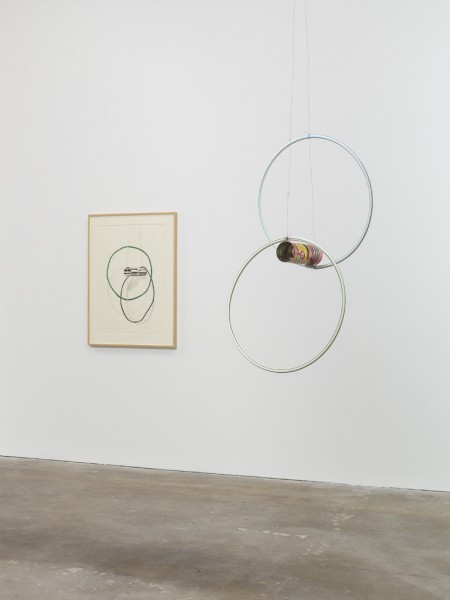
installation view of Taylor’s ‘Pass the Peas and Can Study,’ 2012. courtesy of David Zwirner.
Pass the Peas and Can Studies
Al Taylor
David Zwirner
It’s remarkable how many qualities of the tin can the label retains when removed.
The physiological trompe l’oeil of collage bridges the gap as Taylor moves back and forth between 2 and 3D.
The best works lay somewhere between Richard Tuttle and Kenji Fujita.
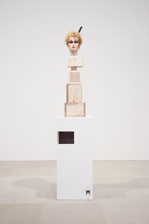
Gelitin’s ‘Latte Macchiato,’ 2012. courtesy of Greene Naftali Gallery.
The Fall Show
Gelatin
Greene Naftali
Very funny!
With painted bases, found objects and mannequin heads, at first glance it looks like another Rachel Harrison show.
Another funny thing is that the sculptures fall.
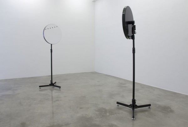
Simon Starling’s ‘Venus Mirrors (05/06/2012, Hawaii & Tahiti Inverted)’, 2012. courtesy of Casey Kaplan.
Triangulation Station A
Simon Starling
Casey Kaplan
Who is the audience?
There are a lot of different kinds of art.
This is one.
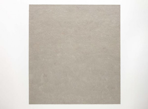
David Scanavino, Untitled (New York Post February 7 - March 27th, 2011), 2011. Via Marianne Boesky
The Void is Not Empty – Jesse Chapman and David Scanavino
Marianne Boesky Gallery
Blended and reconstituted, abstracted and reopened,
Scanavino’s work retains some qualities of the original newspaper.
It has four corners and it’s a papery taupe,
but it’s paper without content, ink without image;
it’s handmade paper.
Specific to a publication and a date or a length of time,
they feel like a timely update on On Kawara’s date paintings
and the clippings that accompany them.
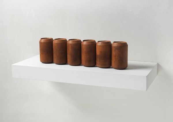
Rachel Whiteread, Half Dozen, 2010. Via Luhring Augustine
Long Eyes – Rachel Whiteread
Luhring Augustine
To the right Whiteread does a kind of Banks Violette black resin Panel.
To the back Whiteread does Johns’ Ballantine cans.
To the back right, as she does, Nauman.
Gary Hill, of surf, death, tropes & tableaux: The Psychedelic Gedankenexperiment, 2011. Via Gladstone
of surf, death, tropes & tableaux: The Psychedelic Gedankenexperiment Gary Hill
Gladstone Gallery
3D glasses (especially cheap ones) don’t make things three dimensional,
nor do they make them look three dimensional;
they function more like lab goggles in this experiment.
Hill employs video better than anybody.
The use of color, flowers, and self in concert with the surf, death and tableaux of the title conjure an unlikely Ashley Bickerton.
Ashley Bickerton, The Preparation with Green Sky, 2007. Via Hungry Hyaena
Paintings, 1958-1968 – Kenneth Noland
Mitchell-Innes & Nash
There was a time when artists were soldiers and pilots before they were artists.
Seen through this war lens, Noland’s concentric circles are sights and the Red/Orange/Yellow chevron is a V for victory.
If these are now logos for consumer products,
here we let them remain symbols.
Kenneth Noland, installation view, 2011. Via Mitchell Innes-Nash
John Chamberlain
Paula Cooper Gallery
Some works (like the 1963 monochrome Marilyn Monroe) are quite sexy
while other works (like the 1990 polychrome Fuccimanooli) recall neighborhood park rehabilitation and beautification projects.
All as seen from Chamberlain’s hospitable oversized urethane foam couch.
The only thing missing was an example of “carved, twisted and tied” foam sculptures to bridge the gap.
Elaine Cameron-Weir, Torso of a Young Woman, 2011. Via Kathleen Cullen
Correspondence – Holt Quentel and Elaine Cameron-Weir
Kathleen Cullen Fine Arts
Correspondence is the right word.
Called ‘Conference Call,’ Carol Bove would have been a likely third.
Torso of a Young Woman speaks softly and “real clear like.”
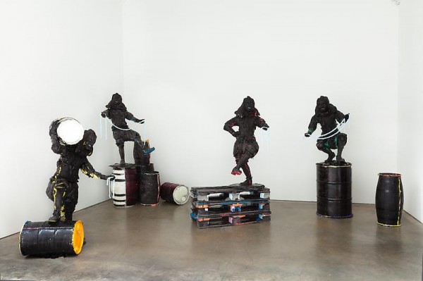
Folkert de Jong, Operation Harmony, installation view, 2011. via James Cohan
Operation Harmony – Folkert de Jong
James Cohan Gallery
What are these about?
They are about something.
The material?
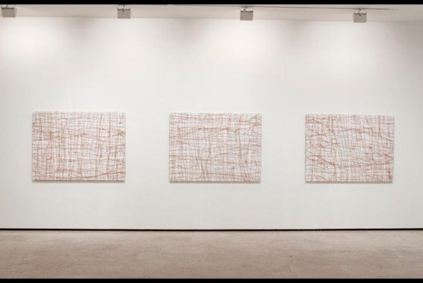
Tim Rollins & K.O.S., installation view, 2011. Via All Art News
Tim Rollins and K.O.S.
Lehmann Maupin
How exactly do these happen?
Starting now, sheet music is to be avoided.
Rope imagery is also to be avoided.
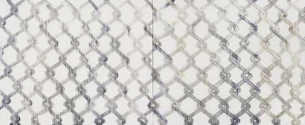
Bernard Frize, Roc, 2010. Via Luhring Augustine
Tony Feher at The Pace Gallery
Colored liquid contained by vinyl tubes fills the space.
The predetermined food coloring palate adds to a sense of containment.
An unexpected leak from the ceiling steals the show.
Untitled (Painting) at Luhring Augustine
When low-tech problems produce high-tech solutions, there is nothing worse.
But when simple processes produce complex results, there is nothing better.
Bernard Frize’s sprayed acrylic lines on canvas have an inexplicable
and disorienting effect unlike anything I have ever felt.
Amnesia at Andrea Rosen
Never has symmetry been such a perfect and potent tool.
On Kawara date paintings with their corresponding boxes and newspapers
mirror monitors and stools on the opposite wall playing a selection of videos.
The space between feels laced together, tight, like a boot.
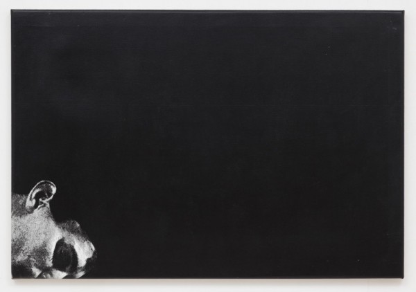
John Stezaker, Untitled, 1978. Via Fredrich Petzel
John Stezaker at Friedrich Petzel
These untitled black and white works on linen,
might as easily have been the postscript to the more recognizable collage magazine pages.
But as precursor, they are more lovable.
If you’re never seen a Stezaker over 8.5×11, or before 2000, they are here.
Jacob Kassay, Robert Morris, Virginia Overton at Mitchell-Innes & Nash
Make a white painting, use a fluorescent light, do site specific.
In 2010 these actions point to their own sustained potential
(and possibly of the artists that employ them.)
Virginia Overton’s Douglas fir works use space as found material.
Martin Boyce at Tanya Bonakdar
The press release deciphers the scattered steel letters on wall mounted slabs as saying, “empty pools,” “undisturbed air,” and “remembered skies.”
Whether these are or are not the lyrics to a Pavement song is debatable.
The wood grain on concrete panel looks like other art that’s interested in architecture.
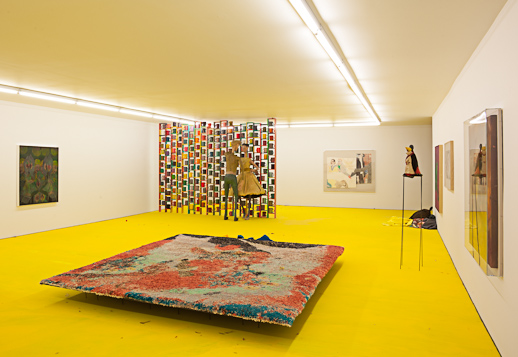
Kai Althoff, Punkt, Absatz, Blümli (period, paragraph, Blümli), 2011. Installation view via Gladstone
David Miko and Tom Thayer’s New World Pig at The Kitchen
In Albert Oehlen’s Untitled (9 1/2 weeks) a couple blocks north at Green Naftali,
the artist projects Adrian Lyne’s 1986 film on a painting,
but in this well-lit room the painting is king.
Given the nature of the paintings and videos, in Miko and Thayer’s work it is impossible to distinguish between the two without stepping in front of the projector.
Made ‘separately but in tandem’ seems like a good way for these to have happened.
Kai Althoff at Gladstone
It smells like Althoff might have smashed the remaining bottles of his Parkett edition in the corner and sprayed a stronger fragrance over that.
Or somebody was wearing strong perfume.
Also the floors were yellow and the ceiling was lower.
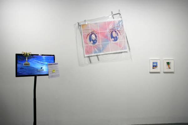
179 Canal/Anyways, installation view. Via 179 Canal
The press release for ‘179 Canal/Anyways’ at White Columns explains that “the space (179 Canal) is currently a mahjong parlor and the project (179 Canal) is here…” Where there were decorative marble floors, uneven stucco walls, and crystal chandeliers now there is concrete, sheetrock and florescent as some of those artists who inhabited 179 make the graceful transition to White Columns. But the work seems comfortable in this environment; as if it had entertained the idea of being here or somewhere like it all along. Most things don’t stay in one place for a long time in New York, not without ‘ownership’, and with the exception of a couch, most of the work here could physically fit in a cab.
What’s more interesting is how these things happen, how they end, and where things go when it’s over. The exhibition is careful to call itself “a look here now” but it can’t help feeling a bit like a eulogy. Theme-less but not without visible affinities, for the most part the work is smart, sometimes serious. Often playful but not without rigor. Sometimes surprisingly refined for coming from an experimental artists’ space. But one gets the impression that these are people who care about what they’re doing. ‘179 Canal/ Anyways’ feels a little like an art equivalent of the culinary saying, “Eat Local, Think Global” with an emphasis on immediate surroundings (in the case of the earlier location, sometimes working in the studios directly above the space or on the street below), but while still addressing real issues and contributing to a discourse. In the creation of a space that extends beyond the physical place, in a community, there are standouts, and 179 is no exception.
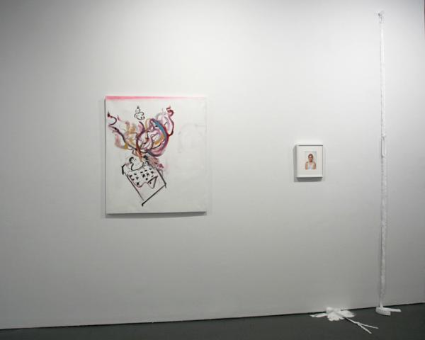
179 Canal/Anyways, installation view. Via 179 Canal
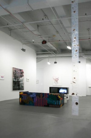
Andrei Koschmieder’s Bait N Gate, a long white zipper hung vertically on the wall was purchased at the zipper store around the corner on Canal and Allan. Hanging above a small, swirling pool of partially transparent, partially opaque white resin with four YKK sliders, the work opens and closes multiple times. The front of the zipper faces the wall, so, by this logic, we are inside. Andrei writes, in an email, “Michael Sanchez mentioned Lynda Benglis when he came over once and saw the puddles… the black ones. The zipper and puddle (white) are more dependent on the surrounding space and walls now…not so autonomous maybe.” The white puddle seems like it has more to do with sex than say, a black puddle would. Blending into the thin strip of wall it occupies, Koschmieder’s work is nonetheless disquieting in its ambivalence. I had heard about works made directly in the gutter of Canal Street that incorporated garbage and other detritus but this one was virgin white.
179 Canal/Anyways, installation view. Via 179 Canal
Another successful play with materials is Stewart Uoo’s Girl Through Window. Composed of a disassembled chrome bathroom rack, a tiled inkjet print of the Manga character Sailor Moon, neodymium magnets and vinyl, the work feels thoughtful. The bathroom rack and vinyl curtain lend Window an anonymous domesticity. Did we catch Sailor Moon in a state of transformation, in the shower? Hung high on the wall, Uoo says, “There are many levels of surface tension that alter and suspend the image of the Sailor moon eyes. Emily Sundblad really liked the piece because she could also relate to the sailor moon image. I consider the show something of having a way at attempting to fetishize and promote a feminist position. I consider this important in my work since I’m a wannabe feminist, a Poser.” Designer magnets– one here, four there, two here— dot the image like beauty marks, simultaneously structural and decorative.
Finally Jared Madere’s Coconut Tapestry a floor-to-ceiling work made by repeating an Adobe Illustrator pattern on sheets of milky inkjet printable transparencies which are then splattered with smashed whole coconuts is trunk, tree, and fruit in one. It’s very digital and very analog. It’s not overly precious. “I like to think that the tapestries are like flowers in a home in this sense, that just like a cut flower arrangement on a dining room table would have to be swapped out every couple of days for fresh ones, the tapestries can be switched out if the coconut debris gets too funky, the dog chews on the corner or your pet parrot pisses on it, or if you just wanna to move it to a room with a different ceiling height.” There’s an openness in all three of these works they can be repositioned or remade out of readily available things. There are instructions with links to chrome bathroom racks, materials checklists, and PDF’s that outline the smashing and taping of coconut shards.
179 Canal/Anyways, installation view. Via 179 Canal
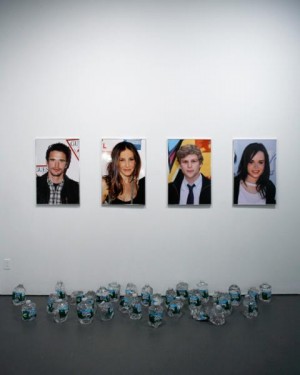
For the most part, artists represented by only one work prove to be the most interesting here. Perhaps the pressure to make one’s position known in one work rather than several was a challenge that distilled or excised less concise and communicative works. This was also true of paintings by Gregory Edwards and Trevor Shimizu. Edwards’ Stranded in the Jungle with superimposed cheetah and polka dot print felt like a marriage of urban and jungle fashion; shallow, but with an effective depth, somehow. Shimizu’s brushy Girlfriend Wants a Baby was good before I saw the title and really good after. Portraying a baby as something like a genie and sex as something like the act of rubbing a lamp; there was an absolute, almost allegorical humor. Josh Kline’s plastic-infused water in boiled Poland Spring bottles represented the opposite end of the humor spectrum.
In April I had seen the work of Anicka Yi on Canal Street, an intense combination of inflatables, Glade plug-ins, hair gel, rice flour and other ingredients that felt not only raw but alive. At White Columns, canvas textured soap cast around stretcher bars felt like nothing more than an unnecessary and played out commentary on painting. They were soap infused with something but looked simply like resin; it felt like different work by a different artist with a totally different set of concerns.
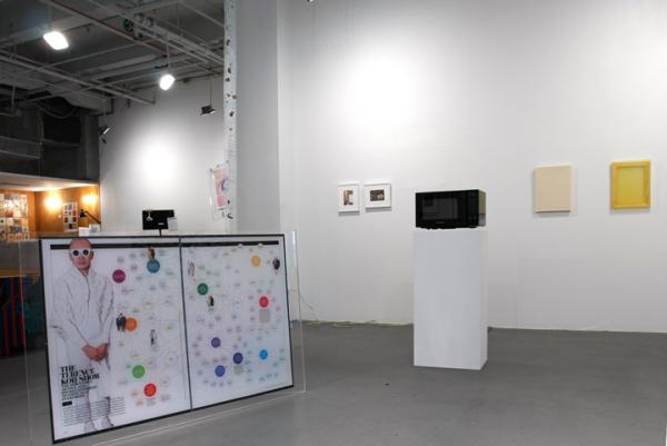
It was also strange to be greeted by a large Plexi-mounted diagram of Terence Koh’s social network, a work by Michael Caputo, and then be told in the press release that what we were looking at was a “group of artists who were tired of art about art.” The release elaborates that this group is also tired of “business as usual, and the heavy history of a past that wasn’t necessarily ours to reference.”
179 Canal/Anyways. installation view. Via 179 Canal
The danger here is in how quickly we historicize the recent past or label something as a movement. To say this is what we’ve done, this is our story, to make an official story. Inevitably we misrepresent ourselves. On one hand, what better form of history-writing than the autobiography; on the other, what more flawed form? But with a great deal of awareness and a pervasive sense of gratitude, ‘179 Canal/ Anyways’ manages to escape what seems like trap. Instead it more or less does what it claims to do, present a “loose but tight community,” a group show with an above average amount of overlaps in affinity and not in form. Crucially to its success, the show raises the question: did 179 Canal have to close in order for this White Columns’ show to happen? Does everything that enters this particular space have to die a little death before it’s acceptable? I would have liked to see this show while the original space existed concurrently. The intro could have read, “the space (179 Canal) is currently there and then project (179 Canal) is here…” Maybe then some works wouldn’t have felt like they had cleaned up their act quite so much.
]]>
Tyler Dobson, A Luxury is Difficult to Do Without, 2010. via Real Fine
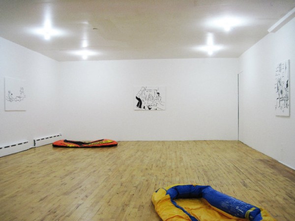
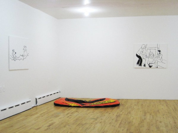
Tyler Dobson’s second exhibition at Real Fine Arts, a space he co-founded with Ben Morgan Cleveland (think Alan Belcher and Peter Nagy’s Nature Morte Gallery in ’82) presents four new works based on New Yorker cartoons and two others, both deflated rafts.
Seen together, the works seem strangely familiar, but its uncertain if this familiarity is due to the recognizable style of the New Yorker cartoons, or because they have been similarly appropriated before. Even without being able to think of a specific example, one gets the feeling that it has been done and redone and done again, and that this recontextualization is not likely the last. If the saying, ‘Those who don’t know history often end up repeating it,’ could be adapted to art it might read, ‘Those who know art history often end up repeating it.’ But the question shifts: in what ways is it new?
The paintings, matte black lines on thin white canvas, appear nearly indecipherable from the white wall and show only the image; they’re pure picture. The works are also untitled. But unlike the caption-less cartoons in the back of the magazine that invite the viewer to generate their own, here one gets the impression that they have been removed, in addition to other editing, cropping, and subtle adjustments. Formalized, scrubbed, ‘re-opened up,’ the images lend themselves to the canvas without committing to being paintings.
Dobson appears to be interested in making non-paintings (earlier works have involved fabric dye, spackle, toilet paper, stain, candle wax and dye on canvas), and the works in A Luxury is Difficult to Do Without are visually a move away from the painterly results of these materials meeting the canvas. Like the previous work, these retain a sort of matter-of-fact scale, grandless and average. They seem interested in the potential of painting to be critical and, at the same, flirt with the idea of painting as a market commodity (in a relatively non-commercial context). Still, there is a simplicity in their production, contained in the singular action of making copies. The result is as restrained, discreet, and reserved as if they had actually come from a Xerox machine. Like the artists of the Pictures Generation in the 1970’s, Dobson calls into question ideas of authorship and authenticity, original and copy; all the more so for hanging his work on a wall over store-bought rafts.
Tyler Dobson, A Luxury is Difficult to Do Without, 2010. Via Real Fine
These deflated rafts provide the only hint of color in the otherwise black and white space. Relating to sculpture with a confusion echoing the one between New Yorker cartoons and painting, the works are sutured further by the implication of a shared upper middle-class/ lower upper-class demographic. More than Koon’s laboriously crafted cast bronze rafts, Dobson’s recall Michael Krebber’s sawn surfboards. In terms of attitude and treatment, and as defunct tools of leisure, the works are similarly concerned with presenting themselves as sculpture in the tension between buying and making.
The press release contains a picture of the artist on the beach at sunset positioned above a 500-word story. The omniscient narration that begins, “He flew to Nantucket on a Saturday” and lists, at one point, a number of italicized names including those of Ralph Lauren and Alex Katz, might be autobiographical. It sounds, in any case, like the musings of a thoughtful young man on vacation. This character’s examination of the potential transformation of driftwood or of the elevation of lobster from lower-class staple to signal extravagance may parallel Dobson’s thinking about work and relaxation, luxury and the quotidian.
As I left I was overcome with a wave of potential connections, from Lichtenstein to Shirgly, but these seemed accurate only on the surface. This was humor without the humor, anyways. Non-cartoons and non-painting, non-rafts and non-sculpture. Non-press release. Yet somehow the rafts seem half full.
]]>